This post is part 1/4 of my Visualizing Latency series.
A latency heatmap is a particularly useful tool for visualizing latency. For a great treatment of latency heatmaps, please read Brendan Gregg’s Latency Heat Maps page and the ACM Queue article Visualizing System Latency.
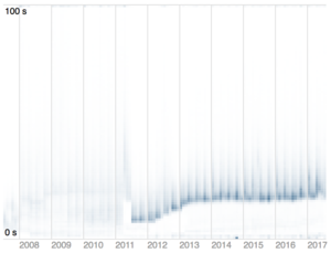
On the right, you can see a latency heatmap generated from a job queueing system which shows a number of interesting properties, not least of which is that the system appears to be getting slower over time.
In order to make creating latency heatmaps easier, I decided to create a reusable D3 latency heatmap chart component. The goal of this component is to handle all the hard work of chart rendering on behalf of the user, so that a user needs to do little more than combine the chart component with their raw data on a web page. Additionally, animating the chart is quite straightforward (see github.com/sengelha/d3-latency-heatmap/samples/animated-heatmap.html for an example).
My D3 latency heatmap chart component is open source and available on GitHub at https://github.com/sengelha/d3-latency-heatmap.
Creating this chart required me to overcome a number of interesting challenges, such as:
- How to create a reusable D3 chart component? (Ultimately I based my code on Mike Bostock’s Towards Reusable Charts proposal)
- How to effectively use D3 scales for rendering non-points
- How to correctly use D3’s .data(), .enter(), and .exit() to support in-place updates (required for animation)
Feel free to reach out to me with any questions or suggestions!